The font on The Wolfman poster is all capitals and a contrasting colour compared to the background. It also has a slightly blurred effect to make it look more interesting. The colour theme is black and white, with only the wolfman and the title eye catching to the audience. I may use this bold, capitals font for my ideas as it seems popular within horror and thriller films. The character used in this poster is looking directly at the viewer with a scary expression, which would be a good way to attract audiences if they like horror films. The cast names are in a different colour, this may be because there are some well known actors in the film so they may want fans of the actors to recognise they are in it, and watch it.
The Crazies has the same sort of colour theme, except for the title which is in a bright red font. This definitely attracts attention as it is a lot bolder colour that the background. The colour red also symbolises blood which adds effect and gives an idea that the film is going to be gory. The pitch fork is more contrasted than the floor so it stands out, and has droplets of blood trailing after it which adds to the effect.
However, the title is not in a main focal point such as the centre of the screen so the attention is not directly on the title of the film. This could be an interesting idea because it puts focus onto the image and the title without either one being too overpowering.
There are a lot of credits and information at the bottom which is unlike most movie posters, therefore I dont think we will put that much information on our posters because we dont there to be too much small writing which may disinterest the reader.
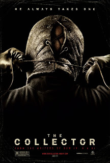
The Collector poster is similar to The Wolfman poster and The Crazies, as they all have tiny hints as to what the film is about without revealing much at all. This one is effective as it is shocking but mysterious at the same time as there is no actual information as to what this image could mean. The image has little light to give a dark effect, but the font of the title is also in a bold colour and all the letters are capitals. The caption below the title is in red, which could also symbol blood, however it isn't anywhere near the size of the title so that it doesn't overpower it.
I think that this poster includes a good amount of information as it isn't too plain and simple, but it doesn't have too much information to be off-putting.

The Uninvited poster gives the gist of the film away straight away. However, it is still mysterious and looks very exciting. I think this poster would definitely appeal to horror film lovers. The writing is also different to the other posters I have looked at because it looks uneven and sort of hand written. This gives a spooky effect, which is why I may choose to use a similar font in my poster, however I have to be careful as our film is also a thriller genre.
FONT TESTING
From using font software, I am going to test out different fonts with our chosen film name to see which ones look best, and which one we may want to use for our films poster.
This one looks as though it is dripping blood, which woud be very good if our film was very gory. However as it is not this may not be best suited. I do like the font of the writing though, so I may chose to keep it.
This font looks quite mysterious however I think it looks like a font from an old film, where as our film is modern so we need a more modern font. I like how the font is quite jagged and creepy however if it was to fit in with the thriller genre as well it may not look as professional.
This font that I chose is similar to some of the fonts from real film posters, as it is very bold and all the letters are in capitals. This makes it stand out and will capture the viewers attention. If the title is powerful and bold it may also effect the film and improve the image.
This is probably one of my favourite fonts, because it has a very intriguing effect however it doesn't particularly represent a certain genre, therefore it would be perfect for our film. It does look quite spooky but it's not too over the top like the first font I chose. I would also have to think about how I could incorporate it into the poster and what colour font I would use as it probably wouldn't look as professional if it was a different colour.
This font is very simple and basic, which was why I chose it as an idea. It is very clear for the reader to see and as it is all in capitals it does stand out. The only problem is that this type of font is sometimes associated with alien movies as it looks very sci-fi.
The following two fonts are quite similar as they are both under the 'handwritten' section. I think both would be good for our film, however the bottom one does look slightly more suitable for a horror title. I think that although they are not in capital letters they do stand out for being slightly different to other horror/thriller films.


No comments:
Post a Comment