Friday 30 April 2010

Audience Feedback Questionnare

(Please circle one of the answers for each question)

Do you think that the teaser trailer was to a professional standard ?

Yes No


Do you think that the lighting that was used looked effective and created the right effect?

Yes No Sort of


Do you think that the film appeared sinister and eery?

Definitely A little No


What aspects did you think looked most effective?

Lighting Camera effects Colour effects(e.g. night vision, blue hue)

Sound Actors Editing


What do you think could be done to improve the trailer?

Different sound effects/song Additional scenes Difference pace (faster/slower)

Different lighting effects More actors

What rating would you give our trailer on a scale of 1 to 10 - 1 being the worst, 10 being the best.

1 2 3 4 5 6 7 8 9 10

Thursday 29 April 2010

Evaluation

In what ways does your media product use, develop or challenge forms and conventions of real media products?

Our target audience was males around the ages of 17 and 24, as these were the ages we chose from carrying out research into who would be more likely to watch horror films. As this was the genre we chose for our film, we needed to make sure we would be attracting the right audience for our trailer. Our ideal audience would be people who were particularly interested in thrillers which also lean slightly towards psychological thriller; that are jumpy and mysterious. Our film is aimed at people who are middle or lower class background as it involves actions which are common in both classes e.g violence. Deciding on the target audience to begin with allowed our group to establish appropriate conventions before we started, therefore enabling us to think deeply into how we were going to appeal to the audiences.
We decided that our genre was going to be horror once we had come up with the basis of our trailer, therefore we used, developed the forms and conventions of other teaser trailers with similar genres, e.g although our film is a thriller, some of the mise-en-scene that we used could be seen as horror such as Rosie getting tied up and hit with a hammer.
When editing the teaser trailer, it involved putting together and editing the footage which used several conventions of a professional trailer. The music that we used fitted very well with the genre of our film as it was quite slow to begin with (the sound of Rosie's shoes blends in with the beginning of our soundtrack) and then escalated into a very loud and dramatic pace when it was reaching the intense shots in the trailer, which we found was very common in most horror trailers as it's purpose is to attract the audience and keep their attention. Therefore this uses the forms and conventions of a professional t
railer. The lyrics are not specifically related to the film, however there are various parts which are similar such as 'come on in' could be seen as Rosie being led into Asif's trap. The music then trails off during the ending shots which is also similar to professional trailers as it is signaling the end - followed by the title of the film. I think that these factors develop conventions as the soundtrack has lyrical relevance fitting in with the trailer at various points throughout. However, it doesn't challenge the conventions or forms of real media trailers as it is likely that several songs used in trailers have lyrical relevance.
I think that the lighting that we used looks very effective as we tried to use a variety of different effects such as flashing lights, blue light, night vision etc.. As some shots used flashing lights for several seconds it also creates a disco effect which may seem mysterious to the audience but it also may catch the attention of our target audiences as this may be the sort of lighting that they are used to at their age. This is then followed by the night vision effect which gives a green tint to the shots through the alleyway. One of the main factors that we aimed to use was chiaroscuro to create contrasts of light and dark lighting which I think that we achieved throughout most of the trailer along with pronounced shadows to enhance this effect. I think we used and developed the conventions of real trailers in this way as we continued our ideas all the way through the trailer, however I don't think that we challenged it. The screen shot below captured some of the flashing lights in this scene:


We tried to use different camera effects and techniques to make the trailer intriguing, the hand held camera effect imparticularly. We used the hand held camera during the shots when Rosie is being carried by Asif, this is to show from Rosie's point of view which is not as common in teaser trailers therefore we challenged the forms and conventions of real media in this aspect. During this scene we also shot parts with an unfocused camera, this added to the mysteriousness as the audience will be unsure whats happening and where she is. We also shot the audition room with a slight angle on the camera, as this is the panic scene so it adds to the image and exaggerates its unusualness, this also challenges the forms and conventions or real media products as this is uncommon in trailers.


Other features that we found were important during research was how the title of the film was positioned and looked and the release date/coming soon. We noticed that most teaser trailers had the title of the film at the end. This is most likely because if the audience are interested in what the film is they will have to watch it till the end to see what it is called, therefore we used this theory too; our title 'Psychopath' is followed by 'Autumn 2011'. I think that here we have used the conventions and forms of real teaser trailers but I don't think we particularly developed them as we thought it looked more professional at the end of the clip.

For our ancillary texts I think that we have used and developed the conventions and forms of professional products, however I think that we have challenged them also. For example, on the poster we have included the title in the middle at the top which is a common positioning on film posters therefore using the conventions of real products, however we have decided to not include several features that may be seen as important on film posters such as a short caption about the film, only included the starring actors name and we have also not added a rating or a production company. This is challenging the forms and conventions of real products as these features are rarely missed off film posters however we agreed that our picture on the poster is so detailed that too much additional information made it look messy.


 These show the similarities between a professional film poster and our version e.g. busy and intriguing background, large title, smaller captions about producers/directors etc, the name of starring actor in a larger font and a short caption linking to the film.


From comparing our ancillary magazine cover and a real media one it is clear that we have tried to use and develop the conventions as we have used a large title, additional features, a bar code and prices.


How effective is the combination of your main product and ancillary texts?


When creating the main task and the ancillary texts we decided on a style/theme that we wanted to use for each product so that it was clear to the audience that they were all linked together. E.g by using cross media advertising; when companies use a variety of ways to market and advertise their products, but in our case using only a magazine cover and a poster. This was essential because if all three products looked different and had their own themes then they wouldn't be associated with each other, therefore the audience would get confused and it would probably put them off the film. Also by making a clear distinction between the three, cross media advertising would make it a lot more recognizable and popular, for example; someone may see the poster and be intrigued and will then see the tailer which will then tease them into wanting to watch the actual film. Or if they see the trailer and then the magazine cover they may be more likely to buy it as they might want to know more about the film.
The photographs we have used for the ancillary texts are all similar and one of the images from the poster is also the main image on the magazine, this is also cross media advertising because its most likely that if someone sees the same photo on different things it will be recognized more. They are all photographs of Rosie and Matt as they are the main focus of the ancillary texts (Rosie is the main character) and they are dressed in bright clothes so that they are eye catching, they also contrast with the backgrounds as they both include several colours.
The shots used in the trailer don't include close ups of Rosie, and no actual shots of Matt giving a very mysterious and edgy effect. Therefore the poster and magazine cover are the only close up images of the actors visible to the audience - this could also be another reason why they might attract attention as they will want to see who the actors are. Although Asif is not shown in the ancillary texts he is a main part in the trailer, therefore we did include shots of him so that the audience can have a connection with him before watching the film as they already know he's going to be the 'bad guy'.
The main colour scheme we have used is neon but with dark hints as we wanted it to be extremely contrasted and eye catching but dark and mysterious at the same time, therefore it will reflect on the style of the film. This is shown in the trailer as we used flashing coloured lights to create a sense of panic when Rosie is attacked and it is shown in the ancillary texts. During the trailer we adapted this slightly because we couldn't use flashing lights throughout the whole trailer, therefore we used a night vision effect and chiaroscuro lighting to create strong contrasts between the light and dark parts.
The fonts used on the trailer and the ancillary texts are all different however they still connect together because they are around the same size and each promote the style of the product, for example the text used on the magazine cover looks effective as it is all a 'bold' style, whereas the posters title has a 'dripping blood' effect as the bold font would not match the background as suitably.
Overall I think that the main product and the ancillary texts fit very well together as I believe there is a clear distinction between the three due to the similar themes and images. They also have the same conventions therefore it is clear to the audience that they are all part of the same franchise.


What have you learned from your audience feedback?

Once we had completed our main product and ancillary text we needed to show it to our audiences and collect feedback to see what they thought about it and what we could have done to improve it.
Luckily once we had put the trailer on you tube a few people have commented on it:

-- loved it :)  i really like the green (night vision) effect aswel as teh close up on the car.. the music fitted really well. only improvemnet would be to make sure all camera shots are steady- but apart from that it was really good. well done xx - Thekeira43

-- I really enjoyed it! it was fitting with the genre and quite disturbing! it defenetly set me up for wanting more! i loved the use of colour and i would see this film becasue it gave wet my apetite enough to want to see it, but didn't give too much away. I would give it a  8/10. - Jordy125


To further our audience feedback I then asked ten people to fill in a questionnaire after watching our trailer to see what their opinion was and put the results into graphs:


Do you think that the teaser trailer was to a professional standard?
The majority of people thought that we had done our trailer to a professional standard therefore we have accomplished what we set out to achieve.

Do you think that the lighting that was used looked effective and created the right effect?


Half of our audience who completed the questionnaire thought that the lighting could be improved, and half thought that it created the right effect which was what we achieved to do. This would also help us improve it if we were to do it again.

Do you think that the film appearing sinister and eery?

None of our audience thought that it didn't appear sinister or eery, and the majority said it definitely did therefore this was a good result

What aspects did you find most effective?


The majority of the audience thought that lighting was the best aspect, however the camera effects, sound, colour effects and editing also had good results

What do you think could be done to improve the trailer?


These results were very helpful as I received feedback on what could be improved, additional scenes being the most chosen answer. This answer was helpful as it was negative as such it was just that we didn't include enough shots.


What rating would you give our trailer on a scale of 1 to 10. (1 being the worst, 10 being the best)


The results from this question were very positive as none of the answers were below 5 and most of them were between 7 and 10, therefore this shows that most of our audience enjoyed our trailer.


I then showed a member of our target audience our teaser trailer and asked them to do a short video interview on their opinions of the trailer:


How did you use new media technologies in the construction and research, planning and evaluation stages?


For the research and planning stages of my production my blog was the main place where I added all my information, therefore this was the technology that was used. The blogs format enabled me to add my images, links and embeded videos which made it easier for me to analyse the real media products as i had something to show what I was comparing. It was also easy to save work that was not finished as it shows what was published and what was saved as drafts therefore it made it easy for me to notice what work was incomplete. It was definitely a lot more simpler than using Powerpoint as everything is labelled properly so everything is easy to find.
I also used the internet to carry out my research and to collect all the relevant information that I needed which made this project a lot simpler as it is the most advanced way of collecting information. Youtube was also very helpful as it enabled me to view and analyse videos and trailer, and it also allowed us to put our final trailer on it - so I could embed it onto my blog.


The evaluation stage of this production was useful for finalising all my choices and decisions and enabling me to think about what I have been working on during this production. Therefore, for this stage the main technology I used was my blog as this was where I decided on what i was going to say for all the additional technologies I used. I also used Voice Memos to record part of my answer as I wanted to include different varieties of technology as opposed to just writing everything.
I also used my Mac laptop to record a member of the audience giving their opinions on our trailer, this was so that I also had video footage of someones real opinion.
As as group we also went round college interviewing several people on their opinions on it after viewing our trailer, this was also helpful for us as it gave us a variety of opinions and feedback.
Another media technology that I have used during the evaluation is Youtube as I have used that several times during my evaluation by looking at our trailer and other ones to compare.


Overall I think that the construction stage consisted of the most media technologies and a different variety of media technologies for the research and planning stages. The construction stage was the most demanding as I had to learn to use technologies that I had little experience or no experience with. 
Below is a list of the media technologies I used during the construction stage:


Filming the trailer:


Sony HDV - A1E Camcorder - we used this camcorder to film our teaser trailer as it was compact and light therefore it was easy to use and was perfect for our hand held shots. It also ensured that the video was a good quality which would be it seem more professional.


We also used a tripod for the still shots as we needed to make sure the shots were at a perfect angle.


For the editing part of our trailer we used iMovie as it is often used by professionals when making films therefore we knew that we would be using advanced technology. This was particularly challenging as we had to get used to editing which software we hadn't used before, however after getting used to it it was easy to use and it enabled us to edit to the scenes and shots how we had planned.


This is a screenshot of iMovie, as you can see it is a professional set out however it is not overly complicated and everything is set out clearly - 


When creating the ancillary products we used a Nikon D60 camera as they create a professional finish and it had 10 mega pixels so that the quality would be very good. It also meant that we could easily transfer the images onto a computer where we edited them on Photoshop.


Photoshop - Magazine


When using Photoshop, although I had previous experience we wanted to make our product to an excellent quality (so it wasn't unfocused/blurry when it was made to a larger size). It also enabled us to create different effects and change the fonts to ones I had picked during the font testing.
Here are some screenshots from when Rosie was creating the magazine - 


This image shows that we have made the image 'grainy' so it had a pebbled effect, this makes it seem more eery and creates a more suitable effect than the original image.


This image shows the production of choosing the fonts and changing the sizes and colours. It also shows how Rosie added 'starry' objects which added to the atmosphere and made it look more eye catching.


This image shows how Rosie has added the price to the magazine, this was very important as it one of the factors every real media product (magazine) has therefore we needed to replicate this. From completing my research I also realised that we needed to have a reasonable price as if it was too expensive it would make the audience less likely to buy it. 


The barcode was also something we found was a must have from research. This enables the magazine to be unique and makes it look professional. We achieved this effect by creating a small white box, and added different vertical lines in a variety of widths, we then added numbers at the bottom.

Photoshop - Poster

When creating the poster, the background was very unique therefore this was creating by hand by using a noticeboard and attaching random objects such as receipts, battered photographs, dripping paint etc. Therefore when I was editing the poster for the background I only needed to change the contrast slightly and adjust the colour. I then added the fonts (which I had chosen from doing font testing) and then had to make sure I chose a colour that was immediately visible as the background is so vibrant. Below the screenshots show how the fonts were added using photoshop.   


This was the font that I had downloaded after finding it on the internet from completing font testing. I then adjusted the size to make sure it was large enough to be clear and so that it looked okay on the poster.


When I was investigating our audiences responses to our teaser trailer I asked them to answer my questionnaires. I them put the results into a variety of different charts and graphs so that the results were clear and easy to analyse. 

Spreadsheet (Excel) - Charts/graphs

This process was done by adding the data into certain boxes, with the title at the top so it was clear which results were which. I then highlighted the section and selected the 'chart' option.


From selecting the 'chart' option the box below appeared where I then chose which graphs I wanted to use and what information I wanted to appear in the charts.


Saturday 24 April 2010

Final Anciliary Poster


Our final poster has improved a lot from the first draft as we applied everything that we thought needed changing. The background was the main thing that needed to change as it now fits our sketches of how we wanted it to look a lot more and it also fits with our genre.
The first draft created a cheery effect whereas this one has a more dark and edgy feel. The neon colour scheme catches attention but as there are darker colours it makes it feel a lot more mysterious and creepy.
The notice board has also been greatly improved as it has a lot of other objects therefore it isn't as plain anymore. The objects used on the noticeboard look very effective as there are so many, it captures attention but it also looks very interesting as there is a wide mix of different things for the audience to look at.
As we wanted to create a sort of ripped effect for the photographs we have made the edges a lot more uneven and have scrunched them up to give an old/messy effect. The paint dripping down the side of the noticeboard also makes the poster look unused therefore creating a mysterious and dark look.
The fonts that I used had to be chosen carefully as a lot of the colours I planned on using didn't show up as the background is so 'busy' and colourful, therefore I chose a white with a hint of yellow so it stood out. The 'Psychopath' font was chosen as it has a 'dripping blood' style which I thought would look effective and make the title look intriguing, however I chose to make the additional writing in a different 'type writer' font as I think they go well together but it has a more basic look therefore it doesn't take the attention away from the title but it still has a mysterious look.
From my research I noticed that most films included a short caption about the film which are rhetorical questions or a short statement about the film therefore I put a short caption at the bottom of our poster in a slightly larger font as it's purpose is to give the audience a slight hint as to what the film is about but we wanted to give away as little detail as possible but make it eye catching and intriguing.
I then added our names above the short caption saying who produced the trailer and who starred in it as we wanted to make it look as professional as possible.

Thursday 22 April 2010

Final Anciliary Magazine Cover


This is our final magazine cover which I think has a very eye catching look and creates the right effect that we were aiming for. It also shows representation of the genre we have used as it uses dark colours and has a melancholy feel.
The photograph frame which has been smashed in the middle has an effective look as it gives an edge to the original picture.
From completing research we also had to make sure that we made it look like a professional magazine, therefore we made sure it had a suitable and affordable price and had a barcode. We also added a website to make it appear more realistic and professional.
From my research into what was important in magazine covers, I realised that we also had to include additional features such as interviews and posters; both of which we included in our magazine cover, and made them relevant to our film.
Although the magazines title is in a large, clear font we also needed to make sure that the title of our film stood out almost as much, which is did. However, we did use a different font so we had to be careful that we didn't have incompatible fonts that didn't look right. Choosing our font was simple as we had already carried out font tests into ones which we thought would look good and the colour we chose was white as it stands out the most against the black background.
Along with the large centre photograph, there are also a few other smaller ones so that there are a few hints as to what is in the film however we haven't given much away at all as we needed to catch the audiences attention but not give away too much.
Additional details were important when creating our magazine cover as it wouldn't have looked as effective if it was too simple as no one would be interested in looking at it. Therefore along with the additional content we also added a starry effect to the background to make it more appealing.

Monday 19 April 2010

Anciliary Poster


The image above is the first draft of our movie poster, we have copied our original idea to see what works and what doesn't work. I think that the cork board and the polaroids look effective however it doesn't particularly suit the genre we are trying to create. The pins surrounding the photos are too colourful as our film poster was planned to have a sinister effect and our colour scheme is far too bright and positive. I also think that we need to get rid of the black border as I think it's too big and takes attention away from the actual poster.
The photographs don't create the effect we wanted as it will appear to the audience that these two are a happy couple and the writing is the only hint to the genre therefore creating an opposite effect to the original plans as the aesthetics lean towards a more positive narrative, therefore when I create the final poster I will make sure that i use photos which create an effect that is more suitable to our genre (thriller).
The poster needs to be a lot more detailed therefore we will need to be a lot more precise and focus on the micro aspects, such as using torn paper/burnt edges, news paper clipping, melancholy photographs, maybe metal pins and a gloomier colour scheme etc..
When creating the final poster I will try and add more detail so that most of the notice board is covered and I could also add random objects to create a variety of effects which will make our poster exciting and appealing.

Friday 26 March 2010

Lighting Effects Used in Our Trailer

While we were filming, we wanted to make sure that we got all the right lighting effects so that everything looked how we had imagined it to.
While filming Rosie walking through the hall to her audition room, we used a bright blue lighting which created a spooky effect but it didn't make it look too over the top as it was only for a short amount of time.
When Rosie was in the audition room, we used several different lights to come up with the effects, first of all we used one red light and the main singer light, this gave the room a slight red tint but it wasn't too overpowering as Rosie needed to be visible. The lighting stayed the same until Rosie had collected her chair as told and took it to the centre of the room - at this point the singer light was brighter which made it look as though Rosie was uncomfortable as the light was shining in her eyes therefore she couldn't see anyone or anything around her.
When Asif informed Rosie she needed to improvise with what was about to happen we started slowly using several of the lights and changing the brightness levels to create different effects. When Asif hits Rosie round the head with the hammer we made the lights change colours and kept moving the brightness levels around so that it created a flashing effect, this created a sense of panic which was important when doing that part of the scene. When he was about to hit Rosie we very quickly turned all the lights off so that it was sudden darkness (panic to calm). This enables the audiences to reflect on what had happened and for the scene to calm down.
The lights then come on and the main singer light is bright onto Rosie so that the audience can clearly see that she in unconscious.
The shots were Asif's car is driving away is at night time - which would be necessary so that no one saw him put Rosie in the car, therefore this was easy to shoot as we just used the natural lighting when we were outside.
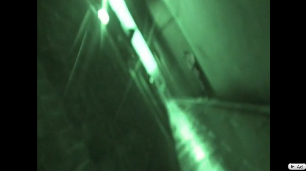
While Rosie is in the alleyway, we used some night vision shots to make the shots look spooky and exciting however we also used some normal daylight shots, but they are unfocused and from Rosies point of view to show the audience that she is dazed. We also used spinning effects which show Rosie's panic.